Google Analytics Dashboards vs. Data Studio: Which is Better for You?
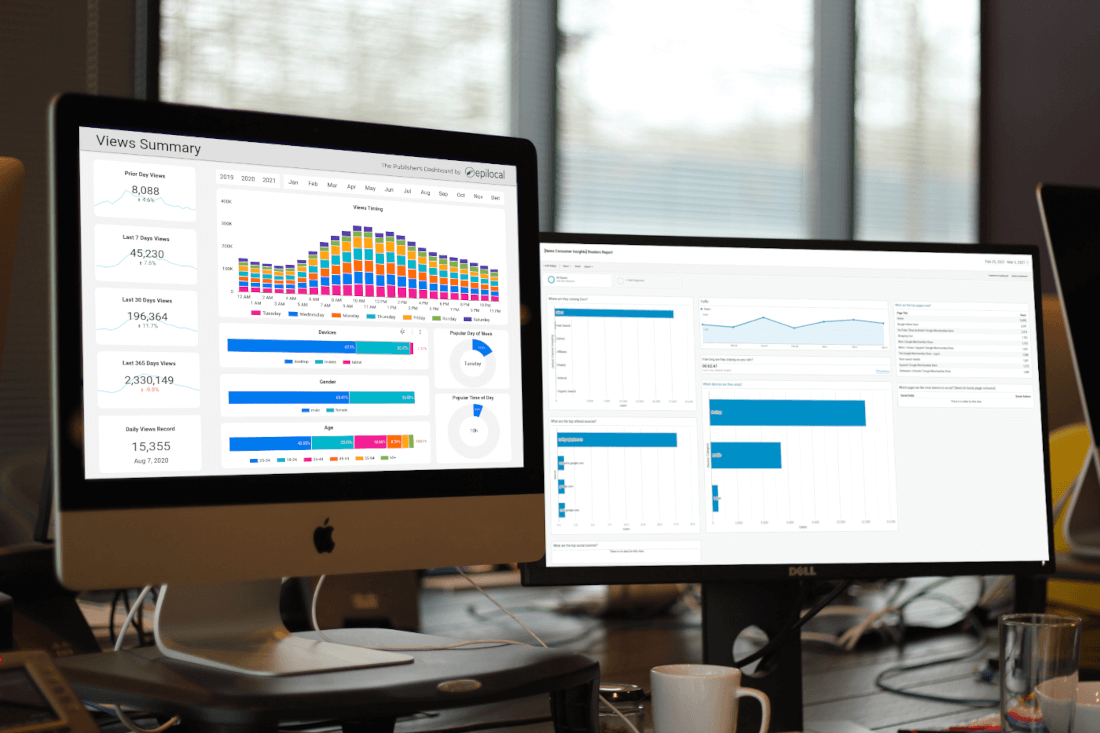
We recently developed a dashboard for online publishers to quickly get insights from their data using Google’s Data Studio. If you haven’t heard of Google Data Studio, you are probably wondering, why should you use a separate tool to look at information that is already available in Google Analytics?
This is a fair point and depending on what you are trying to do with your data, it might make sense to use a Google Analytics dashboard instead. But we feel there are also lots of great reasons to use Google Data Studio as well.
In this post we will look at the pros and cons of using a Google Analytics dashboard vs. Google Data Studio, and see when you should be using one or the other.
What are Google Analytics Dashboards?
First, let’s take a minute to understand what Google Analytics dashboards are. Essentially, in the Google Analytics platform there is the capability to quickly summarize your data using widgets of charts, graphs and tables.
This capability comes built-in to Google Analytics so there are no integration steps required. All you need to do to get started is to download a community dashboard created by others to get some inspiration and start customizing from there.
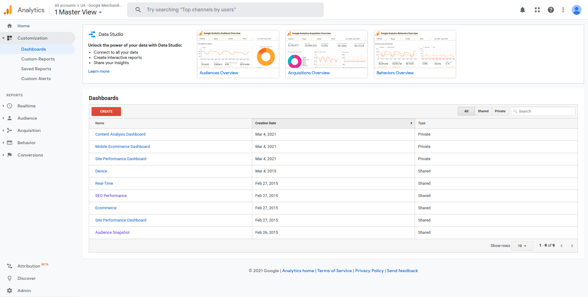
You can access the custom dashboards by clicking on Dashboards under Customization in the left-hand toolbar.
Examples of Google Analytics Dashboards
To really get a sense of what Google Analytics Dashboards are and what they can do for you, here’s a couple of examples of Google Analytics Dashboards that we like.
The first dashboard was built by Google as a part of their News Consumer Insights initiative that aims to help local news sites better understand their audiences. It is called the Readers Report and you can add it to your Google Analytics by clicking here.
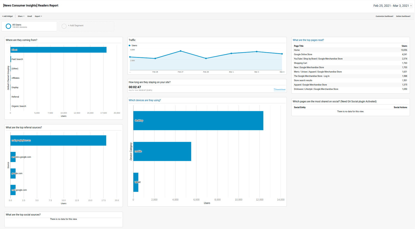
You can see that it gives you a quick summary of your views over time, the sources your readers are coming from and which pages are getting the most views. You can see that there are a couple of different charts available, simple bar and line charts, as well as table widgets for displaying more detailed data.
The second dashboard we will look at is a highly rated community dashboard called the Content Analysis Dashboard, that you can get here.
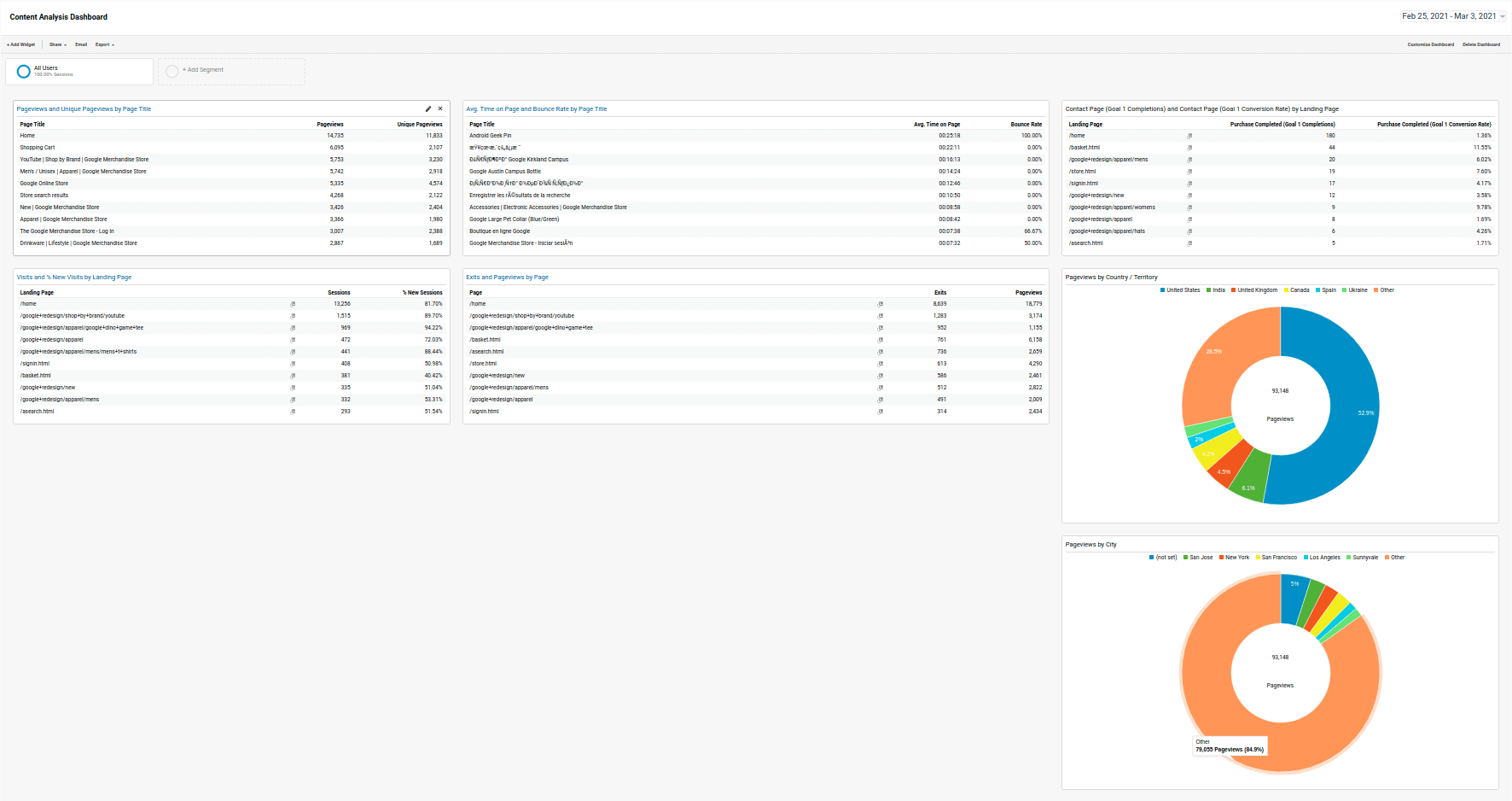
As you can see, you can break-out data using pie charts as they’ve done to show traffic by country and city, and also you can get a quick look at a lot of different data tables at one time. The creator of this dashboard has done a good job of highlighting some of the most important metrics for online publishers like new and return visits by post, reading time by post and goal completions by post.
Pros and Cons of Google Analytics Dashboards
As you can see, creating a custom dashboard in Google Analytics is a snap, as you can just import community dashboards and get started right away.
This is the biggest advantage of Google Analytics Dashboards, you really don’t have to set up anything up at all. On top of that, the widgets are pretty easy to use and there is not much of an additional learning curve over and above knowing your way around Google Analytics.
Essentially, a Google Analytics dashboard is great for taking data from multiple tabs in Google Analytics and getting them on the same page, so you don’t need to click back and forth all the time.
As for the cons, there are some limitations with Google Analytics Dashboards. They don’t have a very wide range of graphs and visualization options for one. Also, if you are sharing data with many people inside or outside of your publication, there’s not really a way to do that while keeping the data interactive. (you need to be logged into your Google Analytics account)
Finally, you are limited to only data that you can get into Google Analytics, so this means that apart from your analytics data, you can get Google Ads and Search Console, but not much else.
What is Google Data Studio?
Google Data Studio, on the other hand, is a tool built specifically for building reports and dashboards. It is a free service offered by Google and as a result, it has pre-built and easy to use integrations to other services like Google Analytics, Google Ads and Google Search Console.
Unlike Google Analytics dashboards, Data Studio allows even more data sources. There are a wide range of community-built data connectors that enable you to bring in data from different platforms, like the data connector we built for Mailchimp for example.
What this means is that you have a wide variety of options for bringing your data together in one place. And once you get it there, Data Studio has a powerful range of visualization tools, with lots of different chart, graph and scorecard options.
You can get started with Data Studio for free simply by logging in here using the same Google account you use for your Google Analytics.
Examples of Dashboards built with Google Data Studio
Let’s look at a couple of examples again to see what you can do with Google Data Studio. The first we will see is our own Publisher’s Dashboard.
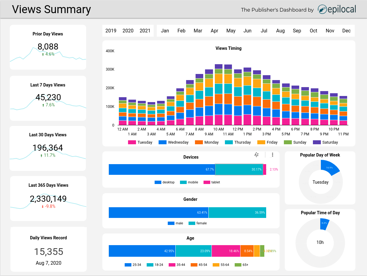
We built the Publisher’s Dashboard to give you everything you need to know about your website with a quick glance. You can see that Data Studio is specifically designed for visualizing data, and thus it has a wider range of design options. In the Publisher’s Dashboard, we combined charts and scorecard metrics to give you key numbers and their trends at the same time, graphs and pie charts to give insights on reader behavior, and an intuitive date picker that makes it easy to view your data from month to month.
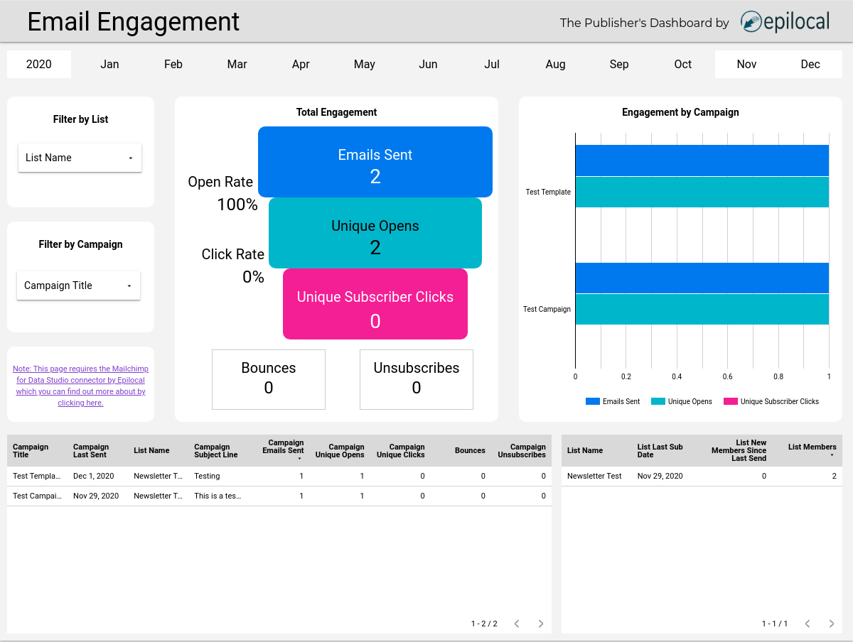
We also took advantage of one of Data Studio’s biggest advantages, the ability to bring in data from non-Google data sources. Using our Mailchimp for Data Studio connector, we created a page in the dashboard to visualize your Mailchimp email marketing and newsletter campaigns, by emails sent, opened, clicked along with metrics like bounces and unsubscribes. With Data Studio, you can bring outside data like this together with your Google Analytics metrics.
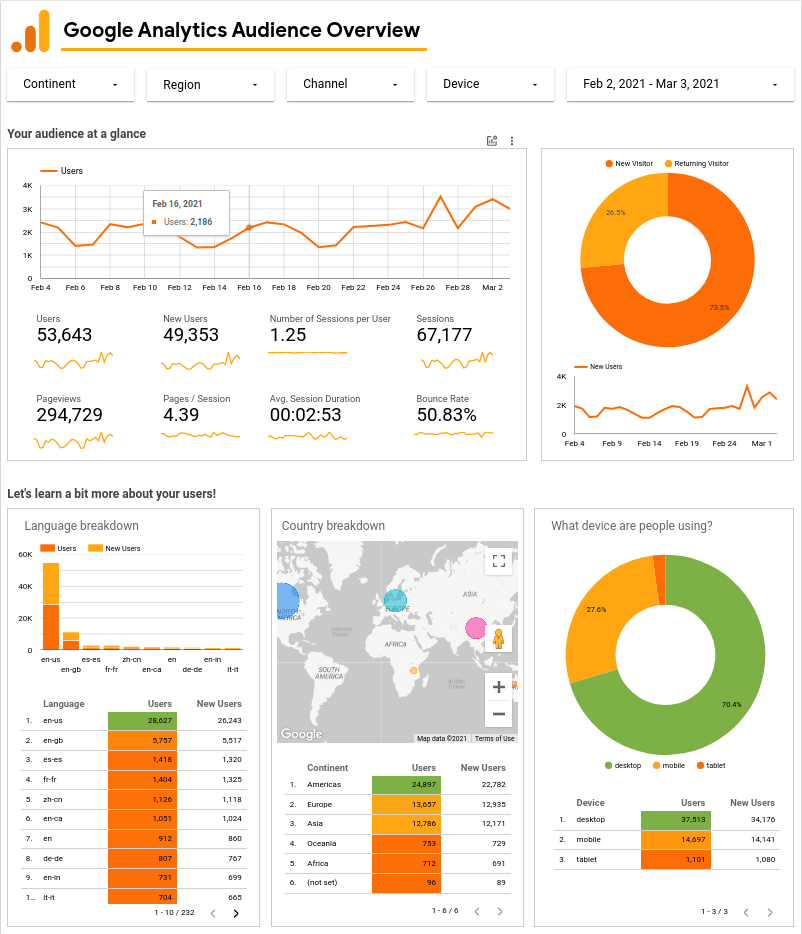
As another example, you can see Google Audience Overview report which again shows how you can mix key metrics with charts to help you get better insights from your data. You can get their free dashboard here.
Pros and Cons of Google Data Studio Dashboards
Compared to Google Analytics Dashboards, Google Data Studio is without a doubt a more powerful tool. It enables you to mix and match many different data sources and it has a wider variety of data visualization options. It also enables a much more flexible use of your data, as the visualizations are not limited to the preset configurations that Google Analytics is. (you can even create your own custom fields - but this is another more advance topic for another day)
On the cons side, it takes a bit more setting up and there is another learning curve beyond just knowing Google Analytics. But like Google Analytics Dashboards, this can be mitigated by taking advantage of the wide range of templates that have already been created by people in the community.
What’s the right dashboard for the job?
Depending on what you are using your dashboard for, either Google Analytics Dashboards or Google Data Studio could be great tools for you. If you are just trying to save some of your time each day by getting your favorite Google Analytics metrics in one place, your best best is to go with Google Analytics Dashboards.
While if you are sharing your data with many people on your team or outside your publication, looking to mix in different data sources, or just go a bit above and beyond the data visualization capabilities that Google Analytics offers, then you should go with Data Studio.

